
In the private label industry, you use similar, generic, and mass-produced products. It’s a business model that could save you money because the cost of production may be lower. Although the upfront costs may not be as much as when you manufacture your own goods, there is one sticky point: standing out.
One way to call attention from the retail shelves is to use the power of color psychology.
The Psychology of Colors
Understanding the psychology of color is important for entrepreneurs and brand designers when choosing the right colors for their brand. The right colors let your audience know who you are and what you do or sell. In some cases, choosing the wrong colors for your brand can drive away potential customers.
Color, in the world of advertising and marketing, correlates directly to persuasion. Since most people perceive colors and immediately link these to their emotions and personal experiences, using colors to boost your brand can be highly effective.
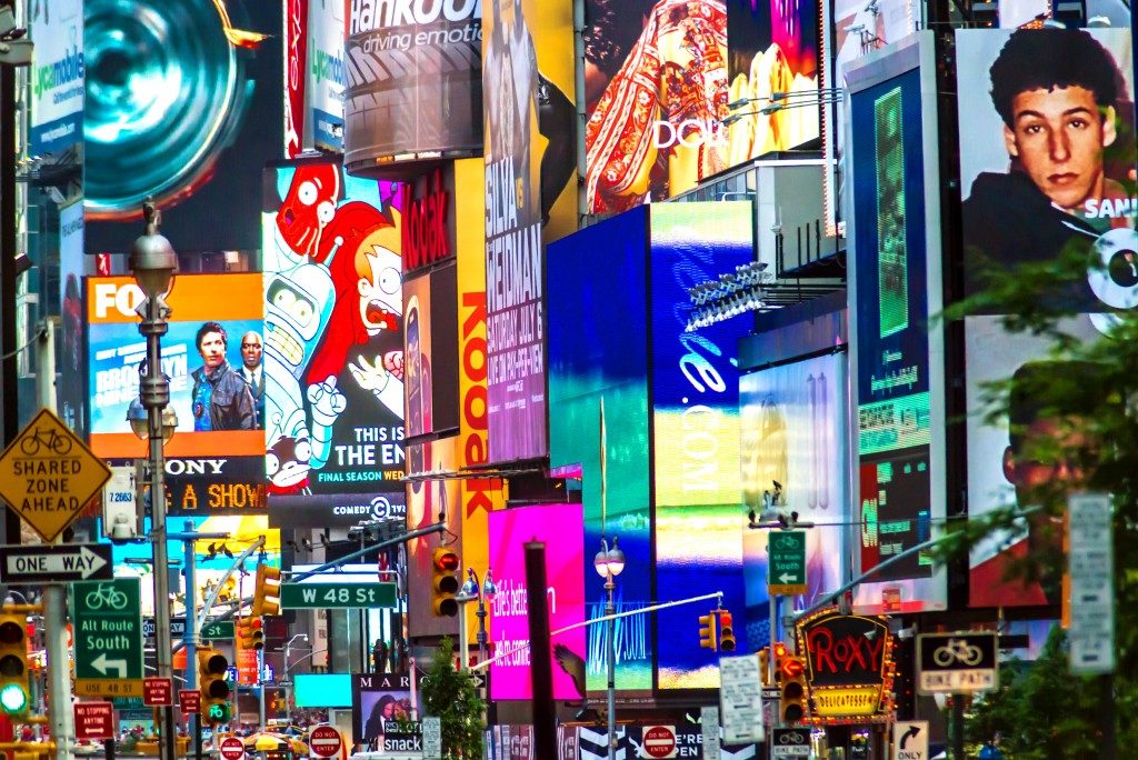
A psychological premise known as the Isolation Effect states that customers remember products better if they stand out from the rest. An experiment proved the likelihood of this premise when participants in a study recalled objects when they had a defining characteristic that made them stick out.
In picking your brand’s color scheme, choosing a non-mainstream shade helps your product emerge from the rest. For example, selling blue plates in a predominantly red plate industry definitely helps your customer notice your product.
Colors in Brand Identity
Studies show that predicting consumer reactions to colors, and how these are associated with the brand prove more important than merely the color itself. So the product you will be selling should live up to what you predict your customers will feel once they see it.
For example, if you’re selling low minimum products from a supplement manufacturer, then you’d like your customers to feel safe and assured once they see your product. After all, food supplement products should invoke feelings of general well-being and encourage trust.
Colors and Their Associations
In building your brand identity, color schemes play a considerable part. The main driving force behind this is the color associations that consumers make. Of course, this is still dependent on several factors, aside from emotional responses. Color perceptions also depend on culture, upbringing, and socioeconomic status. But in general, here are the most commonly used colors in marketing and what they represent:
- Red – It’s perceived to encourage appetite. It also invokes feelings of excitement and passion. Fast food establishments and some private label energy supplements use it.
- Blue – It’s the most universally liked color. It may represent confidence, intelligence, and reliability. Tech companies, some banks, and private label detergents bear this shade on their products.
- Green – Depending on the shade, green tones represent nature, money, freshness, and health. Health and wellness products in both private and commercial business prefer this color.
- Purple – It’s represented by luxury and royalty. Brands, like those in chocolate food manufacturing, that want to create a luxury feel to their products typically use this shade.
On its own, your private label product may look appealing. But on retail shelves with other similar products, it could get lost and be neglected by customers. With the right mix of colors, your product may call attention and persuade buyers.